Ahn Sang-soo, one of Korea’s leading designers, has been giving Hangeul a makeover since the 1980s. His unconventional typefaces, most notably the Ahnsangsoo font, are at the cutting edge of Hangeul typography. In 2007, in recognition of his groundbreaking work in the field of printing, he won the prestigious Gutenberg Prize, awarded by the city of Leipzig in Germany.
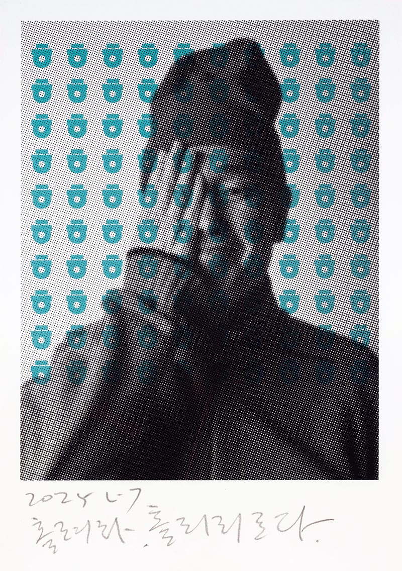
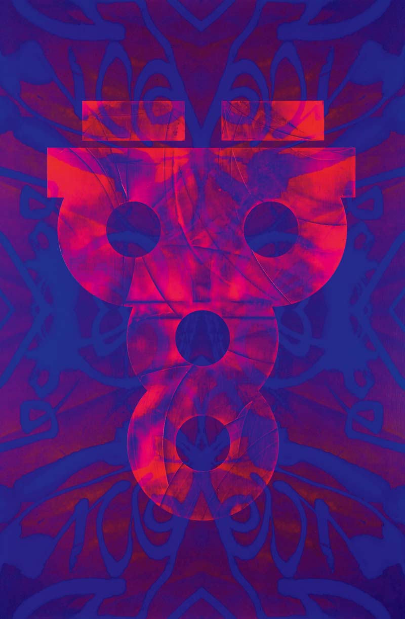
“HOLLYEORA be.spellbound.” 2025. Silkscreen on paper. 100 × 70 cm.
A self-portrait of Ahn rendered through a typographic lens, featured at Ahn Sang-soo’s solo exhibition Beyond Nalgae, HOLLYEORA be.spellbound, held at the Shinsegae Gallery.
Courtesy of AG Typography Institute
When Korean children first learn how to write Hangeul, the Korean alphabet, they use special gridded notebooks. Each row of the grid has eight or ten squares, and each square is designed to hold a single syllabic block. Students are typically seen bearing down on their pencils as they calculate the length and position of each stroke, replicating assigned words by filling the squares. Instructors hover over them, giving directions: “That needs to be straighter,” “Write more clearly,” “Keep it inside the box.”
In 1985, designer Ahn Sang-soo launched the Ahnsangsoo font. It shattered the accepted notion, shaped by Korea’s long history of using Chinese characters, that Hangeul must fit neatly into square blocks, and in doing so, awakened the script’s full potential. Unlike conventional typefaces, this groundbreaking font allows characters to extend beyond the square in different directions. Ahn describes it as one based on “equality,” in which each letter of a syllabic block — initial, medial, and final — is given equal visual weight. Structurally, it is notable for directly aligning the vertical vowel on top with the center of the final consonant at the bottom.
Font developers were opposed at first, questioning whether the Ahnsangsoo font even met the standards of proper typography. Their resistance nearly prevented it from ever being seen on a global scale. But after it was included as a default font in the Korean word processing program Hangul (HWP) in 1991, it gradually caught on with users. It was an innovation born out of regard for the fundamentals.
“As explained in Hunminjeongeum haerye [the 15th-century commentary on Hangeul outlining the principles and purpose behind its creation], the initial, medial, and final letters are written together from left to right and top to bottom to form syllabic units. The Ahnsangsoo font stays faithful to this guiding principle,” Ahn says. “King Sejong [creator of Hangeul] is the greatest designer of all time. The invention of Hangeul must have been just as revolutionary back then as the release of the iPhone in our age.”
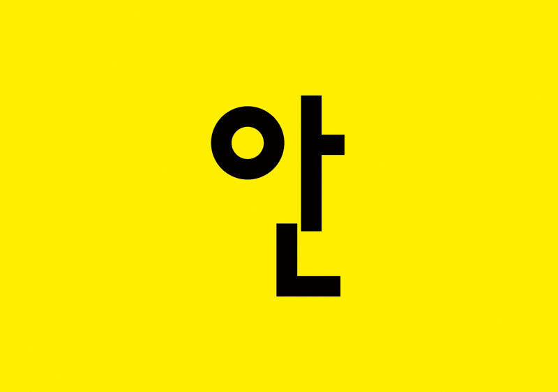
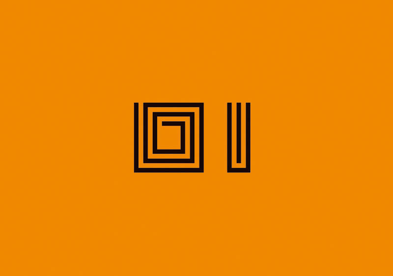
The Ahnsangsoo font: a simple, geometric typeface that breaks free from the square frame traditionally used in Korean typography, based on the principles laid out in the Hunminjeongeum.
Courtesy of AG Typography Institute
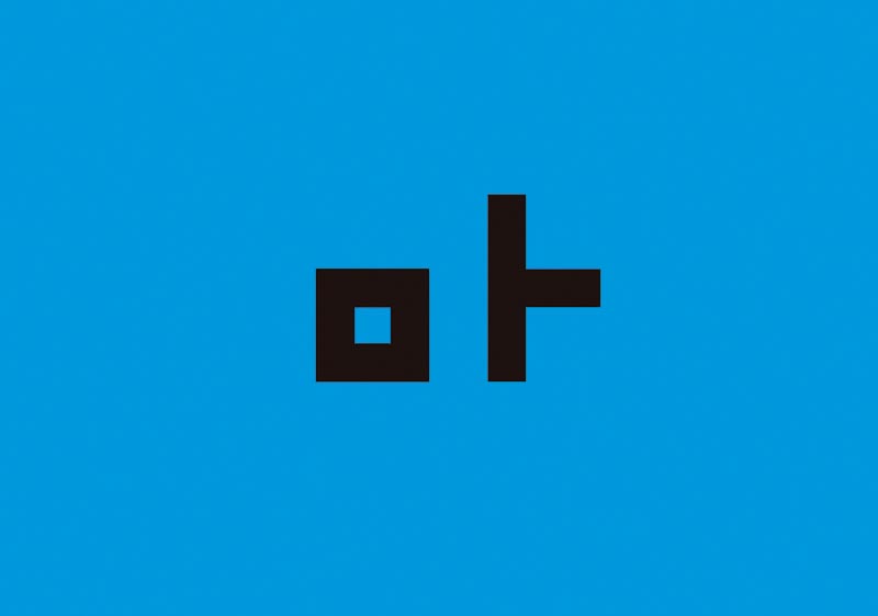
The Mano font: a typeface composed of linear modules developed after the Ahnsangsoo font through experimentation with the Sebeolsik three-set modular typeface.
Courtesy of AG Typography Institute
The Leesang font: a typeface created by dismantling and rearranging the Ahnsangsoo font, inspired by the avant-garde and surrealist works of poet and author Yi Sang.
Courtesy of AG Typography Institute
The Myrrh font: a typeface composed of square modules, designed using spatial principles such as stacking and altering modular forms.
Courtesy of AG Typography Institute
A POSTMODERN TYPEFACE
Born in 1952 in Chungju, North Chungcheong Province, Ahn’s introduction to the world of design came at Hongik University’s College of Fine Arts. While serving as editor-in-chief of the campus newspaper, he published a comic strip he had drawn. Noticing how typeset letters were reversed during the printing process, he started to develop an interest in typography. Even after joining GoldStar (the predecessor to LG Electronics) as a designer, Ahn continued to launch and edit magazines.
The design of letters often mirrors the spirit of the time. The 1980s in Korea were marked by strong resistance to authoritarianism and social conformity. The Ahnsangsoo font emerged during a time of loud, widespread outcries for democratization and diversity. Its departure from the square frame became a subtle act of defiance against the established system — one that pointed toward a new era. Introduced around the same time that deconstruction came to Korea, the font became one of the earliest symbols of postmodernism in Korean design.
As a young man, Ahn refused to be tied to established norms. In 1988, in his mid-thirties, he and his friend Geum Nuri — younger brother of renowned conductor Geum Nansae — opened an “electronic café” in a back alley across from Hongik University. It was a place that hosted everything from film screenings and online community meetups to live telematic art performances connecting Seoul and Los Angeles. Regarded as one of the precursors to today’s PC bang (Korean internet cafés where customers primarily play online games), it became a breeding ground for the indie culture that would redefine Hongdae.
When asked how he defines design, Ahn replies, “It’s the act of ‘making’ style, just like we ‘make’ clothes, food, and homes. In Korean, the verb jitda [‘to make’] carries immense weight, and is even used to describe actions like ‘committing’ a crime or ‘composing’ poetry. Everyone has a sense of style, and even something considered tacky can be stylish in its own way. Design isn’t about being stylish, but about making style.”
LETTER PAINTINGS
Ahn has worn the same outfit every day since retiring in 2012 from his position as a professor at Hongik University in Seoul: overalls and a beanie. This is his work uniform. He believes that identity comes from consistency; just as letters are built on a shared social agreement rooted in such consistency, Ahn has designed his daily appearance in the same spirit.
In the same way that Kim Whanki jump-started abstract art in Korea, Ahn paved the way for Korean design exhibitions. In 2002, the Rodin Gallery (now the Leeum Museum of Art) organized Han-Geul-Sang-Sang, its very first design exhibition, which showcased Ahn’s work. Since then, Ahn has held solo exhibitions around the world, including in Paris, Hong Kong, and Offenbach, Germany. In 2017, the Seoul Museum of Art held a large Ahn Sang-soo retrospective titled nalgae.pati, which later turned into an international traveling exhibition.
Most recently, Ahn held a solo exhibition titled Beyond Nalgae, HOLLYEORA be.spellbound from April to June at the Shinsegae Gallery in Cheongdam-dong, Seoul. It was a continuation of his “HOLLYEORA be.spellbound” series, begun in 2017, which blends folk-art elements with Hangeul in the style of munjado, traditional paintings of pictorial ideographs. In this series, the consonant “ㅎ” (hieut) — corresponding to the “h” sound — takes center stage. It is used to express laughter with the characters “하하” (ha-ha), tears with “흑흑” (heuk-heuk), surprise with “헉” (heok), and resignation with “헐” (heol). With a single letter, Ahn leads viewers through the entire gamut of human emotions.
“Of all the Korean letters, ‘ㅎ’ has the most unique shape,” Ahn says. “It can evoke a million different things depending on who you ask — from laughter to tears. It appears in distinctively Korean words, such as ‘hana’ [one], ‘Hanguk’ [Korea], and ‘heuk’ [soil], but also in words like ‘haengbok’ [happiness], ‘haepi’ [happy], ‘haneul’ [sky], and ‘hebeun’ [heaven].”
While contemporary artists in the West, including Edward Ruscha, Barbara Kruger, and Jenny Holzer, also apply text in their art, their work focuses on delivering a certain message. In contrast, Ahn’s letter paintings impose no meaning of any kind, instead leaving the door open to personal interpretation and emotional connection. Ahn’s latest exhibition opened on April 17 — the anniversary of Yi Sang’s (1910–1937) death, beginning with a memorial performance in the poet’s honor. Yi’s famous short story “Nalgae” (“Wings”) opens with the line, “Have you ever seen a stuffed genius?” and ends with the line, “Wings, spread out again! Fly, let’s fly! Let me fly just this once more!” Yi, who dreamed of becoming an artist but became an architect instead, is Ahn’s role model, which is why he chose to adopt “Nalgae” as his own pseudonym. As he wrote in his doctoral dissertation, “A Typographic Study of Yi Sang’s Poetry,” Ahn regards Yi as Korea’s very first typographer.
“UV_Hangeul Goblin.” 2025. UV print and acrylic on canvas. 145 × 97 cm.
A work combining two “ㅎ” (hieut) and two “ㅇ” (ieung) consonants to form a figure reminiscent of a goblin. Since the early 1990s, Ahn has traveled Korea in search of traditional motifs, adapting them into new designs aimed at reviving the goblin as an artistic symbol.
Courtesy of AG Typography Institute
ANNIVERSARY PROJECT
Since its release four decades ago, the Ahnsangsoo font has continued to evolve. Experimentation has given birth to the Leesang typeface, a deconstructed font in which individual letters are laid out separately rather than combined into syllabic blocks. There are also the Myrrh and Mano fonts, which emerged from exploration with the three-set modular typeface known as Sebeolsik. Despite all this, Ahn shows no signs of slowing down.
The A-Project exhibition, held at Ahn Graphics in Paju, Gyeonggi Province, in October 2024, was organized to mark the 40th anniversary of the Ahnsangsoo font. The project brought together designers from around the world to create new three-set modular typefaces.
Courtesy of AG Typography Institute
“I invited artists and designers from Korea and abroad to create Hangeul designs based on the structure of the Ahnsangsoo font. I thought it would be more meaningful to spread Hangeul through them rather than doing something myself. They approached Hangeul with a fresh imagination, which made for truly outstanding and intriguing results,” Ahn says of the A-Project exhibition, held in October 2024.
As the Ahnsangsoo font turns forty, Ahn is continuing the anniversary project he started last year. So far, 14 renowned designers — including Paula Scher, a titan of typography who was previously featured in a Netflix documentary series, and Neville Brody, an iconic figure of 20th-century design — have already created new typefaces based on the font.
This year’s contributors include notable names such as Kenya Hara, the creative mind behind the Japanese lifestyle brand MUJI. The anniversary exhibition is scheduled to be held around October 9, which is Hangeul Day, a national holiday commemorating the invention of the Korean script. In addition, Ahn is planning several solo exhibitions, including one this year at the Tsutaya Bookstore in Tokyo, and another next year at Beijing’s Central Academy of Fine Arts.
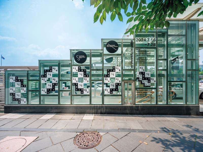
The AG Leesang font featured prominently in the graphic design for Station — Image Community, the 13th Seoul Mediacity Pre-Biennale program, in 2024.
Courtesy of AG Typography Institute